●極座標グラフ
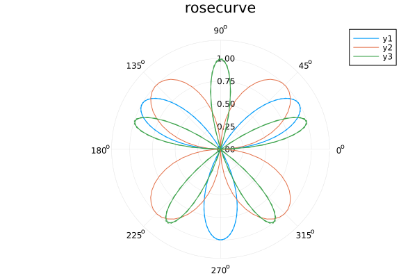
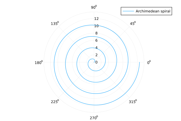
Julia の Plots を使用して極座標グラフ (Polar Plot) を描くには、既存の関数 plot() に属性 proj = :polar (または projection = :polar) を設定する方法が簡単です。plot() の第 1 引数に角度、第 2 引数に半径を渡します。角度はラジアンで指定します。
リスト : バラ曲線

using Plots

theta = range(0, 2 * pi, length=100) # 角度
r1 = sin.(3 * theta)                 # 半径
r2 = sin.(2 * theta)
r3 = sin.(5 * theta)
plot(theta, [r1, r2, r3], proj = :polar, title = "rosecurve")
 バラ曲線
バラ曲線
リスト : アルキメデスの螺旋

using Plots

theta = range(0, 8 * pi, length=500)
r = 0.5 * theta
plot(theta, r, proj = :polar, label = "Archimedean spiral")
 アルキメデスの螺旋
●参考 URL
●多角形の描画
Julia の Plots で Shape 型を使用すると、任意の多角形や領域を描画することができます。Shape([x1, x2, ...], [y1, y2, ...]) で多角形の頂点を指定し、plot(shape) で描画します。plot([shape1, shape2]) のように配列を渡すことで、複数の図形を一度に描画することもできます。なお、Shape はデフォルトで内部を塗りつぶします。
- fillcolor (fc): 図形内部の塗りつぶし色
- fillalpha (fa): 塗りつぶしの透明度 (0.0 ~ 1.0)
- linealpha: 枠線のみの透明度
- opacity: 塗りつぶしと枠線の両方に適用
- linecolor (lc): 境界線の色
- linewidth (lw): 境界線の太さ
リスト : 多角形の描画 (1)

using Plots

x = [1, 6, 11, 8.5, 3.5]
y = [10, 15, 10, 2, 2]

plot(Shape(x, y), ylims=(0, 16))
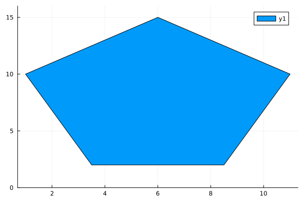 五角形
五角形
リスト : 多角形の描画 (2)

using Plots

# 四角形の頂点を指定
r1 = Shape([2, 4, 4, 2], [15, 15, 1, 1])
r2 = Shape([4, 6, 6, 4], [15, 15, 1, 1])
r3 = Shape([6, 8, 8, 6], [15, 15, 1, 1])
r4 = Shape([8, 10, 10, 8], [15, 15, 1, 1])

plot([r1, r2, r3, r4], xlims=(0, 12), ylims=(0, 16))
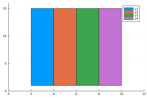 四角形
四角形
リスト : 多角形の描画 (3)
using Plots

# 四角形の頂点を指定
r1 = Shape([2, 4, 4, 2], [15, 15, 1, 1])
r2 = Shape([4, 6, 6, 4], [15, 15, 1, 1])
r3 = Shape([6, 8, 8, 6], [15, 15, 1, 1])
r4 = Shape([8, 10, 10, 8], [15, 15, 1, 1])

# 五角形
x = [1, 6, 11, 8.5, 3.5]
y = [10, 15, 10, 2, 2]
z = Shape(x, y)

plot([r1, r2, r3, r4, z], xlims=(0, 12), ylims=(0, 16), fillalpha = 0.3)
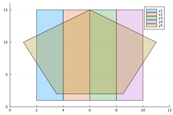 重ね合わせ
重ね合わせ
●塗りつぶし
Julia の Plots で塗りつぶしを行うには属性 fillrange を使用します。
- fillrange: 塗りつぶしの基準 (数値または配列)
- fillalpha: 塗りつぶし部分の透明度
- fillcolor: 塗りつぶしの色
- fill: 上記をまとめて指定, fill = (0, 0.5, :red)
fillrange に数値 n を指定すると、プロットした曲線と直線 y = n の間を塗りつぶします。fillrange にもう一方の曲線の y の値を配列で渡すと、2 つの曲線の間を塗りつぶします。
リスト : 塗りつぶし (1)

using Plots

f2(x) = x ^ 3 - 9 * x
f3(x) = x ^ 4 - 10 * x ^ 2 + 9

plot(f2, -2, 2, fillrange=0, fillalpha=0.3, label = "x^3 - 9x")
plot!(f3, -2, 2, fillrange=-15, fillalpha=0.3, label = "x^4 -10x + 9")
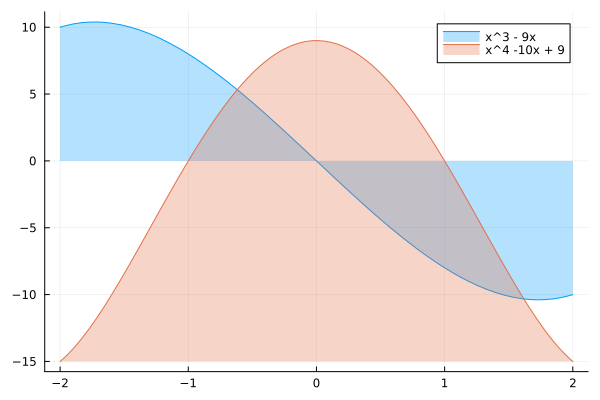 塗りつぶし (1)
リスト : 塗りつぶし (2)

using Plots

f2(x) = x ^ 3 - 9 * x
f3(x) = x ^ 4 - 10 * x ^ 2 + 9

xs = range(2, -2, length=100)
ys2 = [f2(x) for x in xs]
ys3 = [f3(x) for x in xs]

plot(xs, ys2, fillrange=ys3, fillalpha=0.3, label = "x^3 - 9x")
plot!(xs, ys3, label = "x^4 -10x + 9")
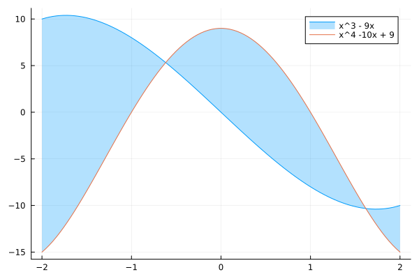 塗りつぶし (2)
●積み上げ面グラフ
積み上げ面グラフ (Stacked Area Chart) は、折れ線グラフの各線の下側を色付けし、それらを上に積み上げた形式のグラフです。時系列などの変化に沿って、全体の合計値の変化と、各カテゴリーが占める割合 (内訳) の両方を一目で確認することができます。Julia の Plots で積み上げ面グラフを描画するには関数 areaplot () を使います。
areaplot(x, y) の引数 x は x 軸の値を格納した配列、引数 y はデータを格納した行列で、行が積み上げられるデータになります。デフォルトでは縦方向にデータを積み上げます。属性 fillalpha で透明度を、fillcolor で色を指定することができます。
リスト : 積み上げ面グラフ

using Plots

# データの準備
x = 1 : 6
y = [1 2 3; 7 8 9; 4 5 6; 5 2 1; 2 6 8; 3 5 7]  # 各行が積み上げられるデータ

# 積層面グラフの作成
areaplot(x, y,
    title = "Stacked Area Chart Example",
    labels = ["Group A" "Group B" "Group C"],
    fillalpha = 0.5)
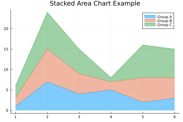 積み上げ面グラフ
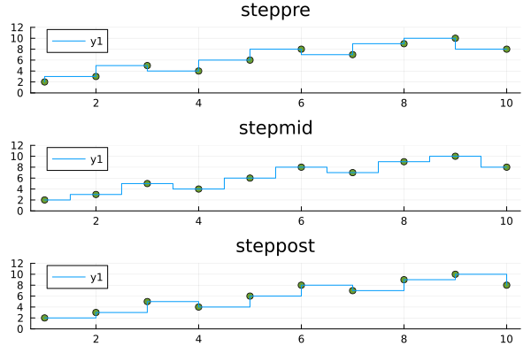
●階段グラフ
階段グラフ (ステップチャート, Step Line Chart) は、データの値が変化するまで、前の値を水平に維持するグラフです Julia の Plots で階段グラフを描画するには、関数 plot() の属性 linetype に以下の値を指定します。
- :steppre
データポイントの手前で垂直に立ち上がる (デフォルト) - :stepmid
データポイントの中間でステップが変化する - :steppost
データポイントを過ぎた後で垂直に変化する
階段グラフでも、通常のプロットと同様のカスタマイズ (たとえば太さや lw = 2 や色 color = :red など) が可能です。また、マーカー markershape = :circle を追加すると、実際のデータポイントがどこにあるか分かりやすくなります。
リスト : 階段グラフ

using Plots

default(markershape = :circle, ylims=(0, 12))

x = 1:10
y = [2, 3, 5, 4, 6, 8, 7, 9, 10, 8]

p1 = plot(x, y, linetype = :steppre,  title="steppre")
p2 = plot(x, y, linetype = :stepmid,  title="stepmid")
p3 = plot(x, y, linetype = :steppost, title="steppost")

plot(p1, p2, p3, layout=(3, 1))
 ステップチャート
●ヒートマップ
ヒートマップ (heatmap) は、数値データの大小を色の濃淡や色相で表現し、データの分布や強弱を一目で把握できるようにしたグラフです。Plots でヒートマップを描画するには、主に関数 heatmap() を使用します。行列データ (2 次元配列) を渡すと、値の大きさを色の濃淡で表現してくれます。
リスト : ヒートマップ (1)

using Plots

# ランダムな行列データを作成
data = rand(20, 20)

# ヒートマップの描画
heatmap(data, title="Basic Heatmap", xlabel="X-axis", ylabel="Y-axis")
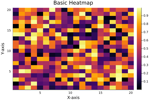 ヒートマップ (1)
x / y 軸の値を指定する場合、第 1 引数に x 軸の範囲、第 2 引数に y 軸の範囲を指定し、第 3 引数に関数 f(x, y) を渡します。
リスト : ヒートマップ (2)

using Plots

x = -5 : 0.25 : 5
y = -10 : 0.5 : 10
f(x, y) = sqrt(x^2 + y^2)

heatmap(x, y, f)
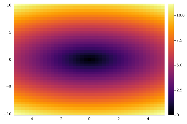 ヒートマップ (2)
第 3 引数は関数ではなく、次のような 1 次元配列でもかまいません。
リスト : 関数の値を 1 次元配列で渡す

z = [f(i, j) for j in y, i in x]
heatmap(x, y, z)
よく用いられる属性を以下に示します。
- c (or color): カラーマップの指定
- :viridis, :magma, :inferno, :grays など
- 詳細は Colorschemes - Plots を参照
- colorbar: :none にすると右側のカラーバーを消せる
- clim: 色の範囲 (最小値, 最大値) を固定する
- annotate: 各セルの中に数値を書き込みたい場合に使用する
リスト : ヒートマップ (3)

using Plots

x = 1 : 0.1 : 10
y = 1 : 0.1 : 10
z = [sin(xi) * cos(yi) for xi in x, yi in y]
heatmap(x, y, z, xlabel="X", ylabel="Y", c=:viridis)
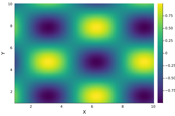 ヒートマップ (3)
●等高線図
Julia の Plots を使用して等高線図を描くには、主に関数 contour() または関数 contourf() を使用します。contour() は線のみ、contourf() は塗りつぶしを行います。基本的な使い方は簡単で、関数 f(x, y) を定義し、x 軸と y 軸の範囲を指定してプロットします。
リスト : 等高線図 (1)

using Plots

x = range(-6, 6, length=100)
y = range(0, 12, length=100)
f(x, y) =  sin(x) + cos(y)

# 線のみ
p1 = contour(x, y, f, title="contour")

# 塗りつぶし
p2 = contourf(x, y, f, title="contourf")

plot(p1, p2)
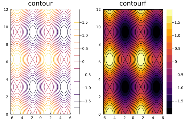 等高線図 (1)
主な属性を以下に示します。
- levels: 等高線の数や、特定の値を指定します。
- ex) levels=10 (10 本の線を描画)
- ex) levels=[-1.0, 0.0, 1.0] (特定の高さのみ描画)
- fill=true: contour 関数内で指定すると contourf と同様に塗りつぶしを行う
- color (または c): 配色 (カラーグラデーション) を指定する
- labels=true: 等高線上に数値ラベルを表示する
リスト : 等高線図 (2)

using Plots

x = y = range(-2, 2, length=100)
f(x, y) = x^2 + y^2

contour(x, y, f,
    levels = [1,2,3,4,5,6,7],
    contour_labels = true,  # 数値ラベルを表示
    c = :thermal,           # 配色
    lw = 2,                 # 線の太さ
    colorbar_title = "Z value"
)
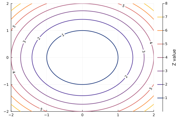 等高線図 (2)
円が歪んで楕円になる場合、属性 ratio=:equal または aspect_ratio=:equal を追加します。これで x 軸と y 軸の単位長さが等しくなります。
リスト : 等高線図 (3)

using Plots

x = range(-3, 3, length=100)
y = range(-2, 2, length=100)
f(x, y) = x^2 + y^2

contour(x, y, f,
    levels = [1,2,3,4,5,6,7],
    contour_labels = true,  # 数値ラベルを表示
    c = :thermal,           # 配色
    lw = 2,                 # 線の太さ
    colorbar_title = "Z value",
    ratio=:equal
)
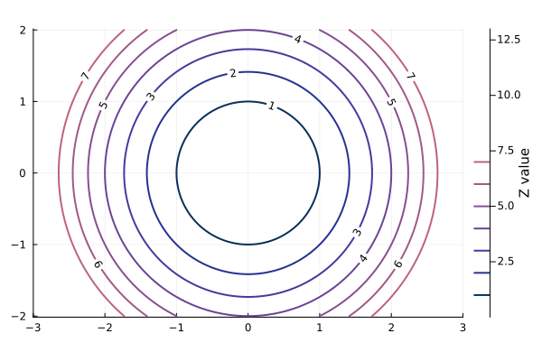 等高線図 (3)
●3 次元の折れ線グラフと散布図
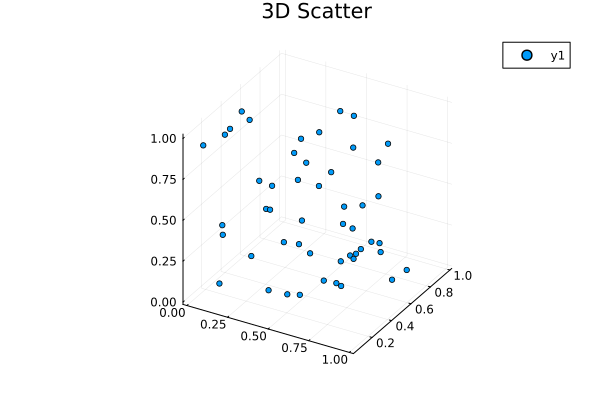
Julia の Plots で 3 次元折れ線グラフ (3D Line Plot) を描画するには、関数 plot() に 3 つの引数 (x, y, z) を渡すか、明示的に関数 plot3d(x, y, z) を使用します。3 次元の散布図は関数 scatter3d(x, y, z) を使うと簡単です。引数 x, y, z は各座標の値を格納した配列です。
リスト : 3D Line Plot

using Plots

z = range(0, 10 * pi, length=500)
x = sin.(z)
y = cos.(z)

plot3d(x, y, z, title="3D Line Plot", lw=2)
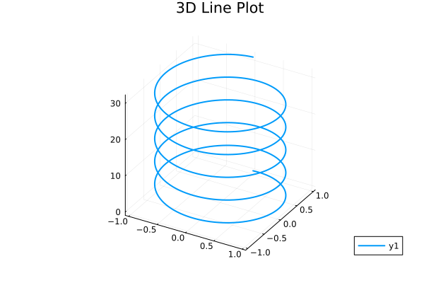 3D Line Plot
リスト : 3D Scatter

using Plots

x, y, z = rand(50), rand(50), rand(50)
scatter3d(x, y, z, markersize=3, title="3D Scatter")
 3D Scatter
●3 次元の曲面
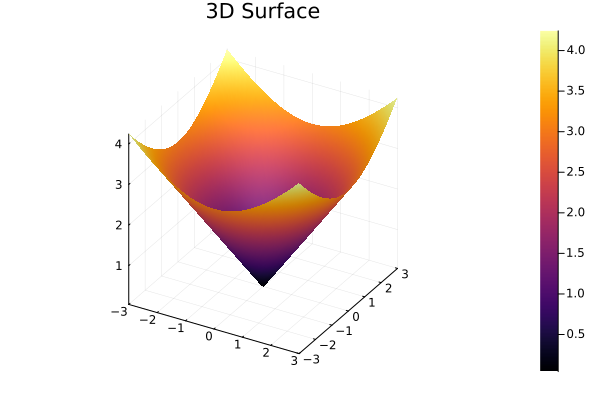
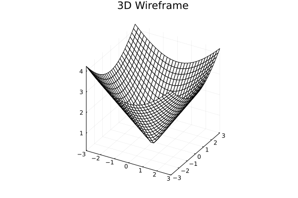
Julia の Plots で 3 次元曲面を描画するには、主に以下の関数を使用します。
- surface(x, y, z): 色付きの塗りつぶしがある 3 次元曲面を描画する
- wireframe(x, y, z): メッシュ (線) のみの 3 次元格子を描画する
2 変数関数 z = f(x, y) を可視化する場合、x 軸と y 軸の範囲を指定し、引数 z に関数 f を渡すのが一般的です。引数の仕様は contour() や heatmap() と同じです。ようするに、contour や heatmap のかわりに上記関数を使うと、3 次元曲面を表示することができます。
リスト : 3 次元の曲面 (1)

using Plots

x = range(-3, 3, length=100)
y = range(-3, 3, length=100)
f(x, y) = sqrt(x^2 + y^2)

surface(x, y, f, title="3D Surface")
 3D Surface
リスト : 3 次元の曲面 (2)

using Plots

x = range(-3, 3, length=30)
y = range(-3, 3, length=30)
f(x, y) = sqrt(x^2 + y^2)

# ワイヤーフレームの描画
wireframe(x, y, f, title="3D Wireframe")
 3D Wireframe
リスト : 3 次元の曲面 (3)

using Plots

x = range(-6, 6, length=30)
y = range(0, 12, length=30)
f(x, y) =  sin(x) + cos(y)

# 線のみ
p1 = wireframe(x, y, f, title="wireframe")

# 塗りつぶし
p2 = surface(x, y, f, title="surface", colorbar=:none)

plot(p1, p2)
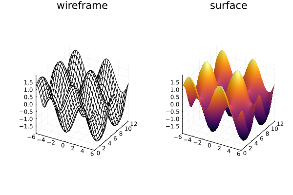 3 次元の曲面
●StatsPlots.jl
StatsPlots.jl は、Julia の標準的なグラフ描画ライブラリである Plots.jl の拡張パッケージです。主に統計的なグラフ表現 (バイオリン図、ボックスプロットなど) や、データフレーム (DataFrame) との連携を強化するために使用されます。
- データフレームとの連携:
@df マクロを使用することで、データフレームの列名をシンボル (:col など) として直接引数に渡すことができる - 統計用のグラフ:
Plots.jl 単体では描画が難しい複雑な統計グラフが簡単に出力可能 - Plots.jl の置き換え:
StatsPlots.jl を読み込むと Plots.jl の機能もすべて含まれるため、置き換えて使用できる
              代表的なグラフの種類

グラフ名            関数名        概要
-----------------------------------------------------------------------
バイオリン図	    violin        データの分布密度を可視化
ボックスプロット    boxplot       四分位数を用いたデータの要約
相関行列プロット    corrplot      変数間の相関関係を一括表示
周辺分布付き散布図  marginalhist  散布図の上下左右にヒストグラムを表示
グループ化棒グラフ  groupedbar    カテゴリごとの比較に適した棒グラフ
●インストール
Julia のパッケージモード (REPL で ] キーを押す) で次のコマンドを実行します。
(@v1.12) pkg> add StatsPlots
インストール終了後 st で状態を表示すると、M.Hiroi の環境では次のように表示されます。
(@v1.12) pkg> st
Status `~/.julia/environments/v1.12/Project.toml`
  [336ed68f] CSV v0.10.16
  [a93c6f00] DataFrames v1.8.2
  [91a5bcdd] Plots v1.41.6
  [f3b207a7] StatsPlots v0.15.8
  [bd369af6] Tables v1.12.1
インストールが終了したら、Backspace または Ctrl + C を押してください。通常の julia> プロンプトに戻ります
●@df マクロ
@df マクロは、DataFrame などのテーブル形式のデータから、列名をシンボルで直接指定してグラフを描画できる便利な機能です。通常、Plots.jl では df.col1 のように毎回データフレーム名を書く必要がありますが、@df を使うとコードが簡潔になります。以下に基本的な使い方を示します。
df データフレーム名 プロット関数(:x軸の列, :y軸の列, ...)
データフレーム名が df だとすると、@df df の後ろにプロット関数を書きます。列名が col だとすると、関数では df.col と書かずに :col だけでアクセスすることができます。列名を指定する際は、文字列 ("col") ではなく必ずシンボル (:col) を使用してください。複数の列をまとめてプロットする場合も、[:col1, :col2] のようにシンボルの配列で指定することができます。
簡単な使用例を示しましょう。
julia> using DataFrames, StatsPlots

julia> df = DataFrame(x = 1: 10, y1 = rand(10), y2 = rand(10))
10×3 DataFrame
 Row │ x      y1        y2
     │ Int64  Float64   Float64
───┼────────────────
   1 │     1  0.301278  0.277377
   2 │     2  0.648894  0.537568
   3 │     3  0.73409   0.661024
   4 │     4  0.702217  0.930322
   5 │     5  0.869844  0.357257
   6 │     6  0.454654  0.167191
   7 │     7  0.350699  0.556037
   8 │     8  0.988648  0.374679
   9 │     9  0.368009  0.350613
  10 │    10  0.46574   0.0113388

julia> @df df plot(:x, [:y1, :y2])
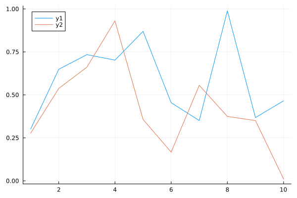 実行例
実行例
●グループ化棒グラフ
グループ化棒グラフ (集合棒グラフ) は、複数の項目(系列)を一つのカテゴリごとに横に並べて比較するためのグラフです。たとえば、年度ごとの売上を商品 A, B, C のグループで比較する場合などに使われます。グループ化棒グラフは StatsPlots の関数 groupedbar() を使うと簡単に描画することができます。行列形式のデータや、データフレーム (DataFrame) を直接扱うことができます。
groupedbar(x, data, ...)
groupedbar(data, ...)
data が行列の場合、各列が 1 つのグループとして扱われます。x は x 軸の目盛りを指定します。簡単な例を示しましょう。次の表を見てください。
     : A   B   C
-----+----------
2010 : 10  20  10
2015 : 15  15  15
2020 : 20  15  15
2025 : 25  10  20
上表は、とある会社の主力商品 A, B, C の年度ごとの売上高だとしましょう。これを行列で表すと次のようになります。
data = [ 10  20  10;
         15  15  15;
         20  15  15;
         25  10  20 ]
第 1 引数 x は x 軸の目盛り、この場合は年度を格納した配列 ["2010", "2015", "2020", "2025"] を渡します。x を省略した場合、デフォルトで x 軸の目盛りは 1, 2, 3, 4 になります。オプション xticks = (1:4, ["2010", "2015", "2020", "2025"]) を指定すると年度に変更することができます。
リスト : グループ化棒グラフ (1)

using StatsPlots

#       A  B  C
data = [10 20 10;  # 2010
        15 15 15;  # 2015
        20 15 15;  # 2020
        25 10 20]  # 2025

groupedbar(
    ["2010", "2015", "2020", "2025"],
    data,
    label = ["A" "B" "C"],
    title = "Grouped Bar Chart")
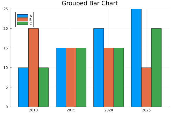 グループ化棒グラフ (1)
groupedbar() は y 軸の値を配列 (ベクタ) で渡すこともできます。その場合、オプション変数 group でグループ分けを設定します。
groupedbar(x, y, group = g, ...)
第 1 引数 x は x 軸の値を格納したベクタ、第 2 引数 y は y 軸の値を格納したベクタ、オプション変数 group はグループを表すデータを格納したベクタです。各ベクタの i 番目の要素 (xi. yi. gi) で一つのデータを表しているので、x と g には同じ要素が複数個存在することになります。
行列 data を列単位でつなげて平坦化する場合、引数 x の値は ["2010", "2015", "2020", "2025"] を 3 回繰り返した値になります。data を行単位でつなげて平坦化すると、各年度 (要素) を 3 回ずつ繰り返した値になります。このような繰り返しは関数 repeat() を使うと簡単です。
repeat(data, N) または repeat(data, outer = N) は、data (配列や文字列) を N 回繰り返した新しい配列や文字列を返します。data が配列の場合、inner = N を指定すると、要素を N 回繰り返した配列を返します。簡単な実行例を示します。
julia> repeat([1,2,3], inner=3)
9-element Vector{Int64}:
 1
 1
 1
 2
 2
 2
 3
 3
 3

julia> repeat([1,2,3], outer=3)
9-element Vector{Int64}:
 1
 2
 3
 1
 2
 3
 1
 2
 3

julia> repeat([1,2,3], 3)
9-element Vector{Int64}:
 1
 2
 3
 1
 2
 3
 1
 2
 3
引数 data が行列の場合、repeat(data, N, M) は data を縦方向に N 回、横方向に M 回繰り返した行列を返します。
julia> repeat([1 2; 3 4], 2)
4×2 Matrix{Int64}:
 1  2
 3  4
 1  2
 3  4

julia> repeat([1 2; 3 4], 2, 3)
4×6 Matrix{Int64}:
 1  2  1  2  1  2
 3  4  3  4  3  4
 1  2  1  2  1  2
 3  4  3  4  3  4
groupedbar() の説明に戻ります。Julia の場合、行列は関数 vec() で平坦化できますが、その結果は列をつなげたものになります。
julia> data
4×3 Matrix{Int64}:
 10  20  10
 15  15  15
 20  15  15
 25  10  20

julia> vec(data)
12-element Vector{Int64}:
 10
 15
 20
 25
 20
 15
 15
 10
 10
 15
 15
 20
転置行列を使うと、行をつないで平坦化することができます。
julia> data'
3×4 adjoint(::Matrix{Int64}) with eltype Int64:
 10  15  20  25
 20  15  15  10
 10  15  15  20

julia> vec(data')
12-element reshape(adjoint(::Matrix{Int64}), 12) with eltype Int64:
 10
 20
 10
 15
 15
 15
 20
 15
 15
 25
 10
 20
オプション変数 group は要素のグループを表す配列です。行列 data を列単位で平坦化すると、"A" を 4 回、"B”を 4 回、"C" を 4 回繰り返した配列になります。行単位で平坦化すると、["A", "B", "C"] を 4 回繰り返した配列になります。
これをプログラムすると次のようになります。
リスト : グループ化棒グラフ (2)

using StatsPlots

#       A  B  C
data = [10 20 10;  # 2010
        15 15 15;  # 2015
        20 15 15;  # 2020
        25 10 20]  # 2025

groupedbar(
    repeat(["2010", "2015", "2020", "2025"], outer = 3),
    vec(data),
    group = repeat(["A", "B", "C"], inner = 4),
    title = "Grouped Bar Chart"
)
描画されるグラフは同じなので省略します。なお、行列 data をデータフレームに変換しても簡単にプログラムすることができます。ご参考までに、プログラムリストを示します。
リスト : グループ化棒グラフ (3)

using DataFrames, StatsPlots

#       A  B  C
data = [10 20 10;  # 2010
        15 15 15;  # 2015
        20 15 15;  # 2020
        25 10 20]  # 2025

# データフレームに変換
df = DataFrame(data, [:A, :B, :C])

@df df groupedbar(
    repeat(["2010", "2015", "2020", "2025"], outer = 3),
    [:A; :B; :C],  # vcat(:A, :B, :C) と同じ
    group = repeat(names(df), inner = 4),
    title = "Grouped Bar Chart"
)
●積み上げ棒グラフ
積み上げ棒グラフとは同じ項目内のデータを上に積み上げたグラフのことです。単純な棒グラフの場合、個々の商品の売上高の推移はわかりますが、A, B, C の合計値は明確ではありません。これを積み上げ棒グラフで表すと、次のようになります。
リスト : 積み上げ棒グラフ

using StatsPlots

#       A  B  C
data = [10 20 10;  # 2010
        15 15 15;  # 2015
        20 15 15;  # 2020
        25 10 20]  # 2025

groupedbar(
    ["2010", "2015", "2020", "2025"],
    data,
    bar_position = :stack,
    label = ["A" "B" "C"],
    title = "Grouped Bar Chart")
リスト : 積み上げ棒グラフ (データフレーム版)

using DataFrames, StatsPlots

#       A  B  C
data = [10 20 10;  # 2010
        15 15 15;  # 2015
        20 15 15;  # 2020
        25 10 20]  # 2025

# データフレームに変換
df = DataFrame(data, [:A, :B, :C])

@df df groupedbar(
    repeat(["2010", "2015", "2020", "2025"], outer = 3),
    [:A; :B; :C],  # vcat(:A, :B, :C) と同じ
    group = repeat(names(df), inner = 4),
    bar_position = :stack,
    title = "Grouped Bar Chart"
)
積み上げ棒グラフはオプション bar_position に :stack を指定するだけです。
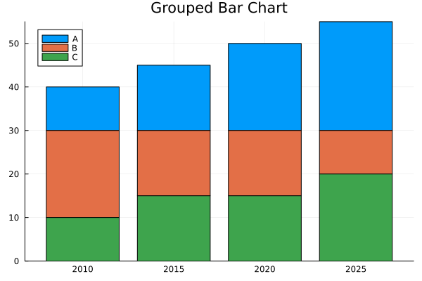 積み上げ棒グラフ
合計値でみると、売上高は右肩上がりであることが一目でわかります。
●グループ化ヒストグラム
関数 groupedhist() を使うと、グループ分けされたヒストグラムを簡単に作成することができます。
groupedhist(value, group = gp_data, ...)
引数 value は値を格納した配列 (ベクタ) です。オプション変数 group は value をグループ分けするときに使用するデータです。group の使い方は groupedbar() と同じです。簡単なサンプルプログラムを示します。
リスト : グループ化ヒストグラム

using StatsPlots

a = randn(50)
b = randn(50) .+ 1
c = randn(50) .+ 2

groupedhist([a; b; c], group = repeat(["A", "B", "C"], inner = 50))
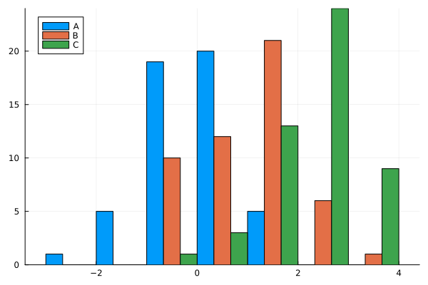 グループ化ヒストグラム
その他のオプションを以下に示します。
- bar_position
:dodge (デフォルト), 各グループのバーを横に並べる
:stack, バーを積み上げる - bins
ビンの数や範囲を指定する ex) bins = 20 や bins = -3:0.5:3 など
●2 次元ヒストグラム
2 次元ヒストグラム (2D Histogram) とは、2 つの数値データの分布 (相関) をヒートマップのような「格子状の区切り」と「色の濃淡」で表現するグラフです。通常のヒストグラムが 1 つのデータのばらつきを見るのに対し、2 次元ヒストグラムは「x 軸と y 軸の組み合わせがどのエリアに集中しているか」を視覚化するのに適しています。
●histogram2d
Juliaで 2 次元ヒストグラムを描画するには、Plots.jl の関数 histogram2d(x, y) を使用するのが一般的です。2 つの配列 (x と y) を渡すだけで、データの密度を色で表現したヒストグラムが作成されます。主なオプションを以下にに示します。
- nbins: ビンの数を指定する。
nbins=(20, 30) のようにタプルで渡すと、x 軸と y 軸で異なる分割数を設定できる。 - color (または c): 配色を指定する。(:heat, :viridis, :magma など)
簡単な例を示しましょう。
julia> using Plots

julia> x = randn(10000)
10000-element Vector{Float64}:
... 省略 ...

julia> y = randn(10000)
10000-element Vector{Float64}:
... 省略 ...

julia> histogram2d(x, y, nbins=30, color=:viridis, title="2D Histogram Example")
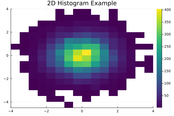 2D ヒストグラム
●marginalhist
周辺分布付き散布図 (Marginal Plot) は、2 変数の相関関係を示す散布図と、それぞれの変数の単独の分布を示すグラフ (ヒストグラムなど) を 1 つに組み合わせたグラフです。データ全体の相関を見つつ、各項目がどのようにバラついているか (偏りや分布の形状) を同時に把握できるのが特徴です。StatsPlots.jl の関数 marginalhist() を使うと、中央に 2D ヒストグラム、その上部と右部に各変数のヒストグラムをひとつにまとめて表示することができます。
marginalhist(x, y, ...)
histogram2d() と同様に nbins や color などのオプションが使えます。
簡単な例を示しましょう。
julia> using StatsPlots

julia> x = randn(10000)
10000-element Vector{Float64}:
... 省略 ...

julia> y = randn(10000)
10000-element Vector{Float64}:
... 省略 ...

julia> marginalhist(x, y, color = :viridis)
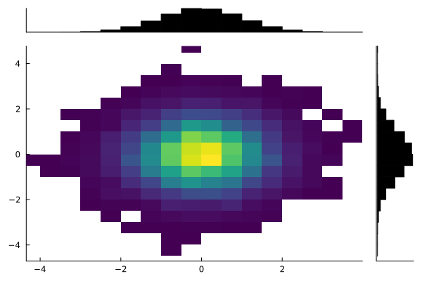 周辺分布付き散布図
●marginalscatter
関数 marginalscatter() を使うと、中央のグラフが散布図になります。各変数の周辺分布はドットで表示されます。
marginalscatter(x, y, ...)
julia> x1 = randn(200)
200-element Vector{Float64}:
... 省略 ...

julia> y1 = x1 .+ randn(200) * 0.5
200-element Vector{Float64}:
... 省略 ...

julia> marginalscatter(x1, y1)
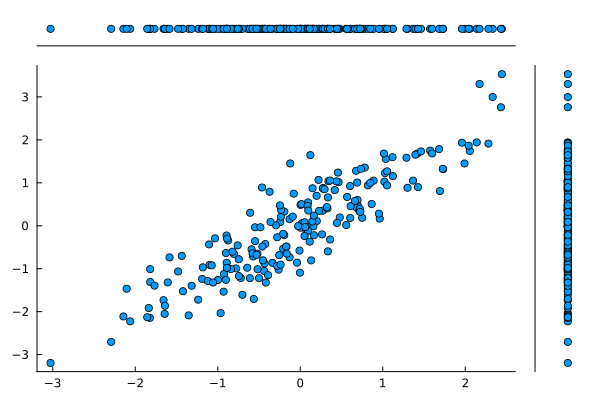 周辺分布付き散布図 (2)
●marginalkde
関数 marginalkde() は、2 次元カーネル密度推定 (KDE) で求めた確率密度を等高線図で表示し、その周辺 (上と右) に各変数の 1 次元密度曲線を配置します。marginalhist() がデータの「個数 (頻度)」を階段状に表示するのに対し、marginalkde() はデータを滑らかな「確率密度」として可視化することができます。確率密度については拙作のページ Algorithms with Python: 統計学の基礎知識 [1] 「連続型の確率分布」をお読みください。
marginalkde(x, y, ...)
等高線の本数はオプション levels で、配色 (カラーグラデーション) は color (または c) で指定することができます。
julia> x2 = randn(1000)
1000-element Vector{Float64}:

julia> y2 = x2 .+ randn(1000) .* 0.5
1000-element Vector{Float64}:

julia> marginalhist(x2, y2, color = :viridis)
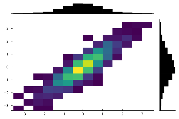 2D ヒストグラム
julia> marginalkde(x2, y2, color = :viridis)
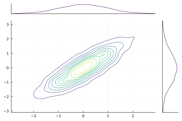 KDE
KDE