●Seaborn
Python の Seaborn は、統計グラフを簡単かつ美しく描くためのデータ可視化ライブラリです。内部で Matplotlib が動いており、少ないコードで洗練されたデザインのグラフや複雑な統計的プロットを作成することができます。主な特徴には次のようなものがあります。
- 美しいデザイン
初期設定のままで、見栄えの良い配色やスタイリッシュなグラフを生成する - 短いコード
Matplotlib で細かく設定が必要な複雑な表現も、少ない行数で記述可能 - Pandas との連携
Pandas のデータフレームと相性が良く、列名を指定するだけでプロットできる - 統計処理の自動化
平均値や分布の密度 (KDE) などを自動で計算してグラフに反映する
Seaborn で描画できる代表的なグラフを以下に示します。
                        代表的なグラフの種類

グラフ名 (メソッド名)           :  概要
--------------------------------+-------------------------------------------------------------------
折れ線グラフ (lineplot)         : 時系列データなど、連続的な変化の推移を表す
散布図 (scatterplot)            : 2 変数の相関関係やデータの分布を点で表す
棒グラフ (barplot)              : カテゴリごとの平均値や合計値を棒の高さで比較する
ヒストグラム (histplot)         : データの頻度分布を棒状のグラフで表す
カーネル密度推定 (kdeplot)      : データの分布を滑らかな曲線で表す
箱ひげ図 (boxplot)              : 中央値や四分位範囲、外れ値をコンパクトに示し、分布を比較する
バイオリンプロット (violinplot) : 箱ひげ図にカーネル密度推定を融合させたグラフ
ペアプロット (pairplot)         : 複数の変数同士の関係を散布図行列として描画する
ジョイントプロット (jointplot)  : 2 変数の散布図と、それぞれの変数単体のヒストグラムを同時に表示する
ヒートマップ (heatmap)          : 相関行列やクロス集計表などの数字の大きさを、色の濃淡で表現する
●インストール
Seaborn は次のコマンドで必要なパッケージをすべてインストールすることができます。
(.venv) $ pip install seaborn
(.venv) $ pip freeze | grep seaborn
seaborn==0.13.2
コマンド pip は仮想環境下で実行する必要があります。仮想環境については拙作のページ 仮想環境とパッケージ を参考にしてください。M.Hiroi がインストールしたのは ver 0.13.2 (2026 年 8 月時点) です。Seaborn はインストールされているがバージョンが古い場合、次のコマンドでパッケージをアップグレードすることができます。
(.venv) $ pip install --upgrade seaborn
●基本的な使い方
まず最初に matplotlib, pandas, seaborn をインポートしてください。
>>> import matplotlib.pyplot as plt
>>> import pandas as pd
>>> import seaborn as sns
>>> import numpy as np
>>>
seaborn には短い別名 sns を付けて読み込むのが慣例です。必要であれば NumPy もインポートしてください。
描画メソッドでよく使われる引数 (オプション) を以下に示します。
- data: 使用する Pandas のデータフレーム (df など) を指定
- x / y: X 軸・Y 軸に使用する列名を指定する
指定がない場合、df.index が X 軸に、列の値が Y 軸になる - hue: 指定した列のカテゴリでグループ分けを行い、グループごとに色分けする
- style: カテゴリごとに点の形(○や×)や線の種類(実線や点線)を変える
- size: カテゴリや数値の大きさに応じて、点や線の太さを変える
- palette: カラーパレットの指定
色分けの色合いをまとめて変更する (例: "viridis", "pastel", "Set2" など) - alpha: 0.0 (完全透明) から 1.0 (不透明) の間で指定
- color: グラフ全体を特定の色に統一したいときに指定 (例: color="skyblue")
簡単な使用例を示します。
リスト : 折れ線グラフ

import matplotlib.pyplot as plt
import pandas as pd
import seaborn as sns

df = pd.DataFrame({
    'avg': [7.1, 8.0, 9.6, 17.1, 20.0, 23.1, 28.7, 29.0, 26.6, 20.6, 13.7, 8.1],
    'max': [11.8, 12.5, 14.8, 21.8, 24.8, 27.7, 33.5, 33.6, 30.9, 24.5, 17.8, 13.2],
    'min': [2.9, 4.1, 5.1, 13.1, 15.6, 19.3, 25.0, 25.7, 23.5, 17.4, 10.2, 3.8]
}, index = range(1, 13))

sns.lineplot(data=df, marker='o')
plt.xlim(0, 13)
plt.ylim(0, 40)
plt.xticks(range(1, 13, 1))
plt.xlabel('Month')
plt.ylabel('Celsius')
plt.title('Average temperature in 2024')

plt.show()
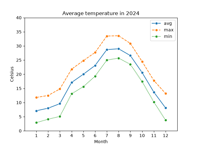 折れ線グラフ
- 複数のグラフを表示する場合、自動的に凡例が作成される
- x / y 軸の範囲や名前の設定には Matplotlib の関数を使う
- 実線で統一する場合は dashes=False を指定すると簡単
リスト : ヒストグラム

import matplotlib.pyplot as plt
import pandas as pd
import seaborn as sns

# 身長
df = pd.DataFrame({
    'Height': [
        148.7, 149.5, 133.7, 157.9, 154.2, 147.8, 154.6, 159.1, 148.2, 153.1,
        138.2, 138.7, 143.5, 153.2, 150.2, 157.3, 145.1, 157.2, 152.3, 148.3,
        152.0, 146.0, 151.5, 139.4, 158.8, 147.6, 144.0, 145.8, 155.4, 155.5,
        153.6, 138.5, 147.1, 149.6, 160.9, 148.9, 157.5, 155.1, 138.9, 153.0,
        153.9, 150.9, 144.4, 160.3, 153.4, 163.0, 150.9, 153.3, 146.6, 153.3,
        152.3, 153.3, 142.8, 149.0, 149.4, 156.5, 141.7, 146.2, 151.0, 156.5,
        150.8, 141.0, 149.0, 163.2, 144.1, 147.1, 167.9, 155.3, 142.9, 148.7,
        164.8, 154.1, 150.4, 154.2, 161.4, 155.0, 146.8, 154.2, 152.7, 149.7,
        151.5, 154.5, 156.8, 150.3, 143.2, 149.5, 145.6, 140.4, 136.5, 146.9,
        158.9, 144.4, 148.1, 155.5, 152.4, 153.3, 142.3, 155.3, 153.1, 152.3
    ]
})

sns.histplot(data=df, x='Height', bins=8)
plt.title('Frequency')

plt.show()
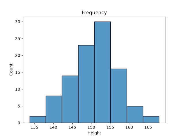 ヒストグラム
リスト : 散布図 (1)

import matplotlib.pyplot as plt
import seaborn as sns
import pandas as pd

df = pd.DataFrame({
    'Year': range(1975, 2022),
    'Celsius': [
        15.6, 15.0, 15.8, 16.1, 16.9, 15.4, 15.0, 16.0, 15.7, 14.9,
        15.7, 15.2, 16.3, 15.4, 16.4, 17.0, 16.4, 16.0, 15.5, 16.9,
        16.3, 15.8, 16.7, 16.7, 17.0, 16.9, 16.5, 16.7, 16.0, 17.3,
        16.2, 16.4, 17.0, 16.4, 16.7, 16.9, 16.5, 16.3, 17.1, 16.6,
        16.4, 16.4, 15.8, 16.8, 16.5, 16.5, 16.6
    ]
})

sns.scatterplot(data=df, x='Year', y='Celsius')
plt.ylim(14, 18)
plt.title('Annual Average Temperature in Tokyo')

plt.show()
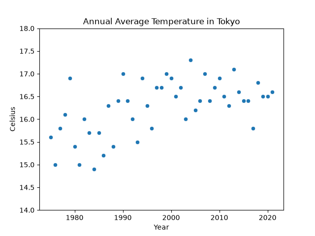 散布図 (1)
リスト : 散布図 (2)

import matplotlib.pyplot as plt
import seaborn as sns
import pandas as pd

# 強い正の相関
data1 = [
    [4.6, 5.5], [0.0, 1.7], [6.4, 7.2], [6.5, 8.3],
    [4.4, 5.7], [1.1, 1.1], [2.8, 4.1], [5.1, 6.7],
    [3.4, 5.0], [5.8, 6.6], [5.7, 6.3], [5.5, 5.6],
    [7.9, 8.7], [3.0, 3.6], [6.8, 8.2], [6.2, 6.2],
    [4.0, 5.0], [8.6, 9.5], [7.5, 8.9], [1.3, 2.6],
    [6.3, 7.4], [3.1, 5.0], [6.1, 8.2], [5.3, 6.6],
    [3.9, 5.1], [5.8, 7.0], [2.6, 3.5], [4.8, 6.3],
    [2.2, 2.9], [5.3, 6.9]
]

# 強い負の相関
data2 = [
    [6.1, 3.7], [3.9, 7.5], [8.6, 1.7], [5.9, 3.9],
    [3.5, 5.5], [7.0, 2.4], [0.9, 9.8], [0.0, 10.2],
    [5.2, 4.2], [3.5, 6.5], [6.9, 3.2], [4.3, 5.9],
    [5.0, 5.9], [7.4, 3.3], [3.1, 6.6], [4.0, 6.2],
    [6.9, 2.9], [4.8, 5.0], [10.6, 0.0], [4.7, 4.3],
    [2.9, 7.6], [7.2, 2.2], [3.6, 6.0], [5.5, 4.3],
    [5.5, 4.5], [6.9, 3.2], [5.8, 3.6], [4.8, 4.6],
    [7.3, 2.5], [4.7, 5.4]
]

df = pd.DataFrame({
    'Xptr': [x[0] for x in data1] + [x[0] for x in data2],
    'Yptr': [y[1] for y in data1] + [y[1] for y in data2],
    'Type': ['Data1' for _ in data1] + ['Data2' for _ in data2]
})

sns.scatterplot(data=df, x='Xptr', y='Yptr', hue='Type')
plt.title('Simple Scatter Plot')

plt.show()
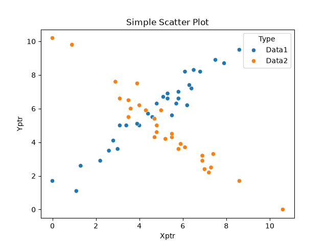 散布図 (2)
- hue='列名' を指定すると、指定した列のデータでグループ分けを行い、自動で色分けも行われる
●オブジェクト指向スタイル
Seaborn でオブジェクト指向スタイルを利用するには、plt.subplots() で生成した Axes オブジェクトを、Seaborn の描画関数の引数 ax に渡す方法が簡単です。オブジェクト指向スタイルで書き直したプログラムを以下に示します。
リスト : オブジェクト指向スタイルのサンプル

import matplotlib.pyplot as plt
import pandas as pd
import seaborn as sns

layout = [
    ['A', 'B'],
    ['C', 'D'],
]

fig, axd = plt.subplot_mosaic(layout, figsize=(8, 6), layout="tight")

# 折れ線グラフ
dfa = pd.DataFrame({
    'avg': [7.1, 8.0, 9.6, 17.1, 20.0, 23.1, 28.7, 29.0, 26.6, 20.6, 13.7, 8.1],
    'max': [11.8, 12.5, 14.8, 21.8, 24.8, 27.7, 33.5, 33.6, 30.9, 24.5, 17.8, 13.2],
    'min': [2.9, 4.1, 5.1, 13.1, 15.6, 19.3, 25.0, 25.7, 23.5, 17.4, 10.2, 3.8]
}, index = range(1, 13))

sns.lineplot(data=dfa, marker='o', ax=axd['A'])
axd['A'].set_xlim(0, 13)
axd['A'].set_ylim(0, 40)
axd['A'].set_xticks(range(1, 13, 1))
axd['A'].set_xlabel('Month')
axd['A'].set_ylabel('Celsius')
axd['A'].set_title('Average temperature in 2024')

# ヒストグラム

# 身長
dfb = pd.DataFrame({
    'Height': [
        148.7, 149.5, 133.7, 157.9, 154.2, 147.8, 154.6, 159.1, 148.2, 153.1,
        138.2, 138.7, 143.5, 153.2, 150.2, 157.3, 145.1, 157.2, 152.3, 148.3,
        152.0, 146.0, 151.5, 139.4, 158.8, 147.6, 144.0, 145.8, 155.4, 155.5,
        153.6, 138.5, 147.1, 149.6, 160.9, 148.9, 157.5, 155.1, 138.9, 153.0,
        153.9, 150.9, 144.4, 160.3, 153.4, 163.0, 150.9, 153.3, 146.6, 153.3,
        152.3, 153.3, 142.8, 149.0, 149.4, 156.5, 141.7, 146.2, 151.0, 156.5,
        150.8, 141.0, 149.0, 163.2, 144.1, 147.1, 167.9, 155.3, 142.9, 148.7,
        164.8, 154.1, 150.4, 154.2, 161.4, 155.0, 146.8, 154.2, 152.7, 149.7,
        151.5, 154.5, 156.8, 150.3, 143.2, 149.5, 145.6, 140.4, 136.5, 146.9,
        158.9, 144.4, 148.1, 155.5, 152.4, 153.3, 142.3, 155.3, 153.1, 152.3
    ]
})

sns.histplot(data=dfb, x='Height', bins=8, ax=axd['B'])
axd['B'].set_title('Frequency')

# 散布図 (1)

dfc = pd.DataFrame({
    'Year': range(1975, 2022),
    'Celsius': [
        15.6, 15.0, 15.8, 16.1, 16.9, 15.4, 15.0, 16.0, 15.7, 14.9,
        15.7, 15.2, 16.3, 15.4, 16.4, 17.0, 16.4, 16.0, 15.5, 16.9,
        16.3, 15.8, 16.7, 16.7, 17.0, 16.9, 16.5, 16.7, 16.0, 17.3,
        16.2, 16.4, 17.0, 16.4, 16.7, 16.9, 16.5, 16.3, 17.1, 16.6,
        16.4, 16.4, 15.8, 16.8, 16.5, 16.5, 16.6
    ]
})

sns.scatterplot(data=dfc, x='Year', y='Celsius', ax=axd['C'])
axd['C'].set_ylim(14, 18)
axd['C'].set_title('Annual Average Temperature in Tokyo')

# 散布図 (2)

# 強い正の相関
data1 = [
    [4.6, 5.5], [0.0, 1.7], [6.4, 7.2], [6.5, 8.3],
    [4.4, 5.7], [1.1, 1.1], [2.8, 4.1], [5.1, 6.7],
    [3.4, 5.0], [5.8, 6.6], [5.7, 6.3], [5.5, 5.6],
    [7.9, 8.7], [3.0, 3.6], [6.8, 8.2], [6.2, 6.2],
    [4.0, 5.0], [8.6, 9.5], [7.5, 8.9], [1.3, 2.6],
    [6.3, 7.4], [3.1, 5.0], [6.1, 8.2], [5.3, 6.6],
    [3.9, 5.1], [5.8, 7.0], [2.6, 3.5], [4.8, 6.3],
    [2.2, 2.9], [5.3, 6.9]
]

# 強い負の相関
data2 = [
    [6.1, 3.7], [3.9, 7.5], [8.6, 1.7], [5.9, 3.9],
    [3.5, 5.5], [7.0, 2.4], [0.9, 9.8], [0.0, 10.2],
    [5.2, 4.2], [3.5, 6.5], [6.9, 3.2], [4.3, 5.9],
    [5.0, 5.9], [7.4, 3.3], [3.1, 6.6], [4.0, 6.2],
    [6.9, 2.9], [4.8, 5.0], [10.6, 0.0], [4.7, 4.3],
    [2.9, 7.6], [7.2, 2.2], [3.6, 6.0], [5.5, 4.3],
    [5.5, 4.5], [6.9, 3.2], [5.8, 3.6], [4.8, 4.6],
    [7.3, 2.5], [4.7, 5.4]
]

dfd = pd.DataFrame({
    'Xptr': [x[0] for x in data1] + [x[0] for x in data2],
    'Yptr': [y[1] for y in data1] + [y[1] for y in data2],
    'Type': ['Data1' for _ in data1] + ['Data2' for _ in data2]
})

sns.scatterplot(data=dfd, x='Xptr', y='Yptr', hue='Type', alpha=0.5, ax=axd['D'])
axd['D'].set_title('Simple Scatter Plot')

plt.show()
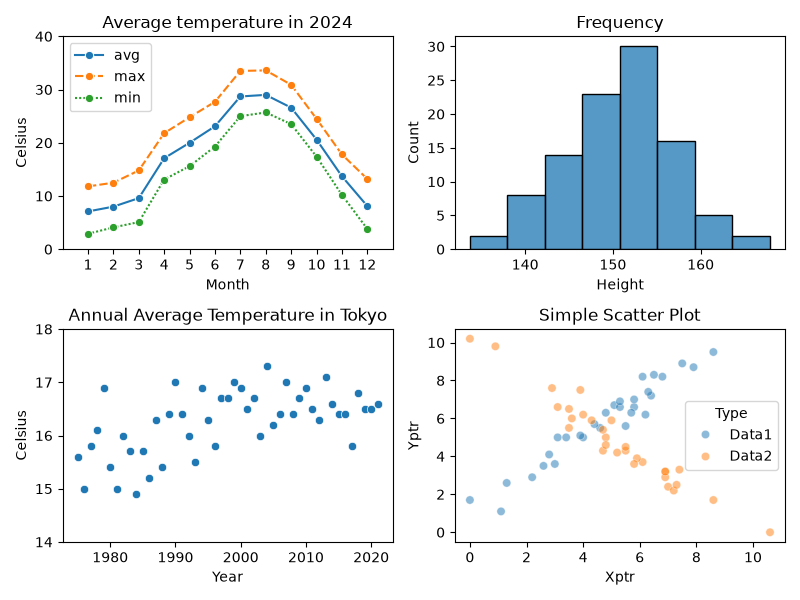 オブジェクト指向スタイルのサンプル
●ジョイントプロット
ジョイントプロットは、2 変数の相関関係を示す散布図と、それぞれの変数の単独の分布を示すグラフ (ヒストグラムなど) を 1 つに組み合わせたグラフです。周辺分布付き散布図と呼ばれることもあります。データ全体の相関を見つつ、各項目がどのようにバラついているか (偏りや分布の形状) を同時に把握できるのが特徴です。Seaborn のメソッド jointplot() を使うと、中央に散布図 (デフォルト) や 2D ヒストグラム、その上部と右部に各変数のヒストグラムをひとつにまとめて表示することができます。
sns.joinplot(data=df, x='列名1', y='列名2', kind='type', ...)
kind 引数を変えることで、中央と外側のグラフの表現スタイルを変更することができます。
- 'reg' : 回帰直線と信頼区間を重ねて描画する
- 'hex' : データの密度を六角形のマス (ヘキサゴン) の濃淡で表現する
- 'kde' : 2 次元の等高線 (カーネル密度推定) で分布の濃淡を描く
- 'hist' : 中央部分を 2 次元のヒートマップ形式のヒストグラムにする
簡単な例を示しましょう。
リスト : ジョイントプロット (散布図)

import matplotlib.pyplot as plt
import seaborn as sns
import pandas as pd
import numpy as np

np.random.seed(42)

df = pd.DataFrame({
    'Data1': np.random.randn(1000),
    'Data2': np.random.randn(1000)
})

sns.jointplot(data=df, x='Data1', y='Data2', alpha=0.4)
plt.show()
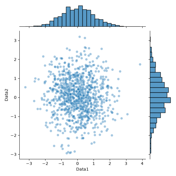 ジョイントプロット (1)
kind='hist' を指定すると、中央の図が 2D ヒストグラムになります。
リスト : ジョイントプロット (2D ヒストグラム)

import matplotlib.pyplot as plt
import seaborn as sns
import pandas as pd
import numpy as np

np.random.seed(42)

df = pd.DataFrame({
    'Data1': np.random.randn(1000),
    'Data2': np.random.randn(1000)
})

sns.jointplot(data=df, x='Data1', y='Data2',
              kind='hist', cmap='viridis')
plt.show()
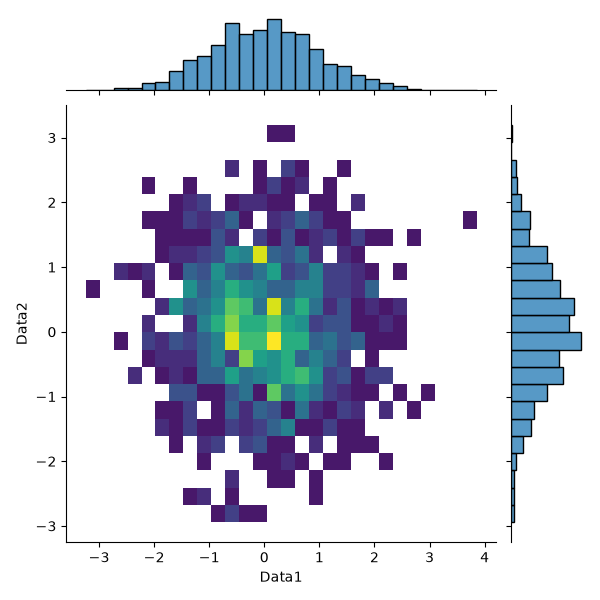 ジョイントプロット (2)
カラーマップを表示する場合は joint_kws={"cbar": True} を指定してください。
kind='kde' を指定すると、2 次元カーネル密度推定 (KDE) で求めた確率密度を等高線図で表示し、その周辺 (上と右) に各変数の 1 次元密度曲線を配置します。データを滑らかな「確率密度」として可視化できるのが特徴です。確率密度については拙作のページ Algorithms with Python: 統計学の基礎知識 [1] 「連続型の確率分布」をお読みください。
引数に fill=True を指定すると、contourf() のように等高線図を塗りつぶします。また、cbar=True を指定するとカラーバーを表示することができます。
リスト : ジョイントプロット (KDE)

import matplotlib.pyplot as plt
import seaborn as sns
import pandas as pd
import numpy as np

np.random.seed(42)

df = pd.DataFrame({
    'Data1': np.random.randn(1000),
    'Data2': np.random.randn(1000)
})

sns.jointplot(data=df, x='Data1', y='Data2',
              kind='kde', fill=True, cbar=True,
              cmap='viridis')
plt.show()
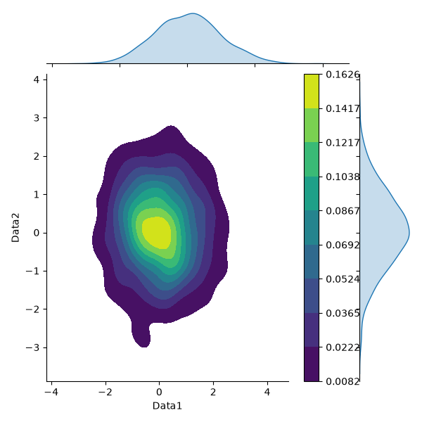 KDE
KDE
●ペアプロット
ペアプロットは、入力変数間の相関関係を可視化する散布図行列 (Correlogram) を自動生成します。対角線上に各変数の「ヒストグラム」、それ以外のところに「散布図」を配置したグラフを 1 つのコマンドで描画できます。
pairplot(data=df)
一番簡単な方法は引数 data にデータフレームを渡すことです。簡単な例を示しましょう。
リスト : ペアプロット

import matplotlib.pyplot as plt
import seaborn as sns
import pandas as pd
import numpy as np

np.random.seed(42)

x1 = np.random.randn(200)

df = pd.DataFrame({
    'Data1': x1,
    'Data2': x1 + np.random.randn(200) * 0.75,
    'Data3': np.random.randn(200) * 0.25 - x1,
})

sns.pairplot(data=df)
plt.show()
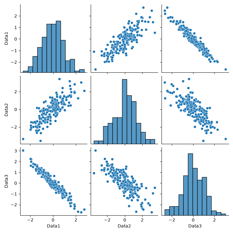 ペアプロット
kind='reg' を指定すると、散布図に回帰直線を引くことができます。
●ボックスプロット
ボックスプロット (box plot, 箱ひげ図) は、データのばらつきや分布の偏りを「箱」と「ひげ」で視覚的に表現する統計グラフです。データを小さい順に並べて 4 等分した「四分位数」をベースに、主に 5 つの統計量を示しています。
- 最小値 : ひげの左端 (または下端) の線
- 第 1 四分位数 Q1 : 箱の左端 (または下端) の線
データを小さい順に並べたとき、下から 1 / 4 番目にあたる値 - 中央値 (メディアン) Q2 : 箱の中にある、最も太い縦線 (または横線)
データを半分に分ける 1 / 2 番目にあたる値 - 第 3 四分位数 Q3 : 箱の右端 (または上端) の線
データを小さい順に並べたとき、下から 3 / 4 番目にあたる値 - 最大値:ひげの右端 (または上端) の線
- 外れ値:ひげの範囲から大きく外れた、ポツンと離れてプロットされる点のこと
ボックスプロットは Matplotlib の関数 boxplot() を使うと簡単に描画することができます。配列だけではなく、行列やデータフレーム (DataFrame) を扱うことができます。
boxplot(data, ...)
data が行列の場合、各列が 1 つのグループとして扱われます。簡単な例を示しましょう。
>>> import matplotlib.pyplot as plt
>>> import numpy as np

>>> np.random.seed(49)
>>> data = np.random.randn(20, 3)

>>> plt.boxplot(data)
... 略 ...
>>> plt.show()
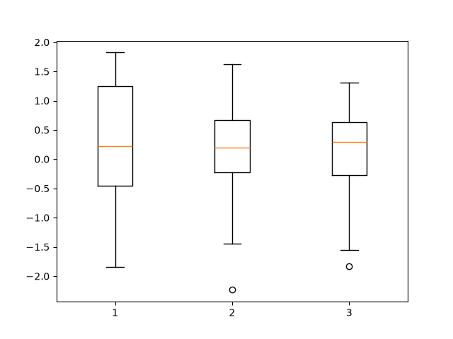 ボックスプロット (1)
plt.boxplot() にはデータフレームを直接渡すことができます。また、vert=False を指定すると、横向きの箱ひげ図になります。
>>> import pandas as pd
>>> df = pd.DataFrame(data, columns=list("ABC"))

>>> plt.boxplot(df, vert=False)
... 略 ...
>>> plt.show()
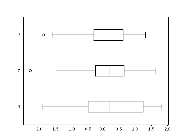 ボックスプロット (2)
Pandas の DataFrameには、標準でメソッド df.boxplot() が用意されています。Matplotlib をベースにしているため、手軽に複数カラムの分布を比較できます。
df.boxplot()
簡単な使用例を示しましょう。
>>> df.boxplot()
<Axes: >
>>> plt.show()
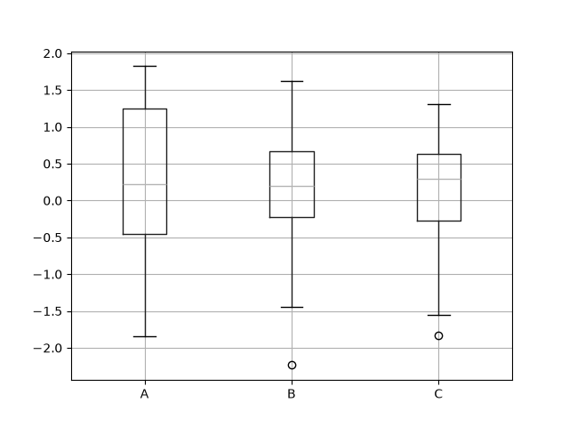 ボックスプロット (3)
主なオプションを以下にに示します。
- vert=False: 箱ひげ図を横向きにする (デフォルトは True)
- grid=False: グリッド線の非表示にする (デフォルトは True で背景に線が入る)
- fontsize=数値: フォントサイズの変更 (軸ラベルの文字サイズを調整)
箱に色を塗りたい場合は、Seaborn のメソッド boxplot() を使ったほうが簡単なのでおススメです。
sns.boxplot(data=df, ...)
簡単な実行例を示します。
>>> import seaborn as sns
>>> sns.boxplot(data=df)
<Axes: >
>>> plt.show()
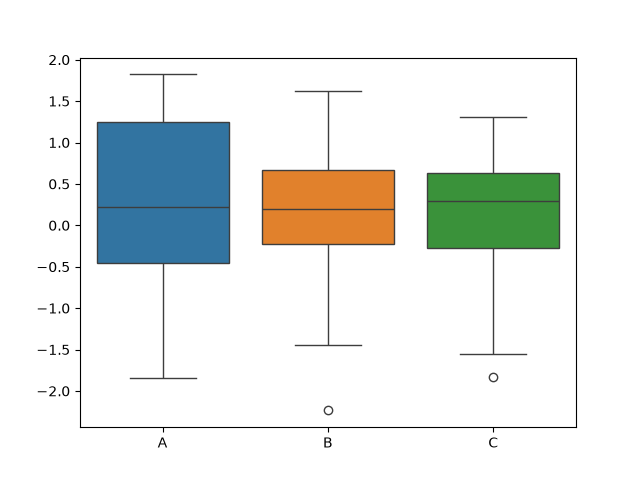 ボックスプロット (4)
グループ分けで使用するデータを列にセットし、それを引数 x に渡すと自動的にグループ分けが行われます。
リスト : ボックスプロット (5)

import matplotlib.pyplot as plt
import pandas as pd
import seaborn as sns
import numpy as np

np.random.seed(49)

# 身長
df = pd.DataFrame({
    'Height': [
        148.7, 149.5, 133.7, 157.9, 154.2, 147.8, 154.6, 159.1, 148.2, 153.1,
        138.2, 138.7, 143.5, 153.2, 150.2, 157.3, 145.1, 157.2, 152.3, 148.3,
        152.0, 146.0, 151.5, 139.4, 158.8, 147.6, 144.0, 145.8, 155.4, 155.5,
        153.6, 138.5, 147.1, 149.6, 160.9, 148.9, 157.5, 155.1, 138.9, 153.0,
        153.9, 150.9, 144.4, 160.3, 153.4, 163.0, 150.9, 153.3, 146.6, 153.3,
        152.3, 153.3, 142.8, 149.0, 149.4, 156.5, 141.7, 146.2, 151.0, 156.5,
        150.8, 141.0, 149.0, 163.2, 144.1, 147.1, 167.9, 155.3, 142.9, 148.7,
        164.8, 154.1, 150.4, 154.2, 161.4, 155.0, 146.8, 154.2, 152.7, 149.7,
        151.5, 154.5, 156.8, 150.3, 143.2, 149.5, 145.6, 140.4, 136.5, 146.9,
        158.9, 144.4, 148.1, 155.5, 152.4, 153.3, 142.3, 155.3, 153.1, 152.3
    ],
    'Class': ['A', 'B'] * 50,
    'Gender': np.random.choice(['Male', 'Female'], 100)
})

sns.boxplot(data=df, x = 'Class', y = 'Height')
plt.show()
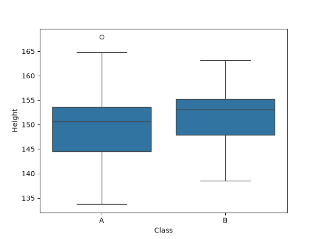 ボックスプロット (5)
ここで、引数 x と y を入れ替えると、横向きの箱ひげ図を描画することができます。また、x = 'Class' のかわりに hue = 'Class' を指定すると、グループごとに色分けが行われます。
リスト : ボックスプロット (6)

sns.boxplot(data=df, x = 'Height', hue = 'Class')
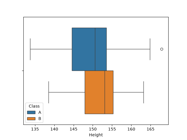 ボックスプロット (6)
引数 x, y を指定したあと、さらに引数 hue を指定すると、データをさらに別の要素で色分け・細分化することができます。
リスト : ボックスプロット (7)

sns.boxplot(data=df, x = 'Class', y = 'Height', hue = 'Gender')
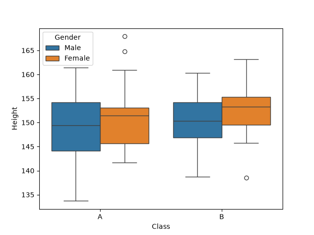 ボックスプロット (7)
色の変更する場合、引数 palette に 'Set2' や 'pastel' などのテーマを指定すると簡単です。また、箱の幅は width=0.5 のように指定して変更することができます。
●ドットプロット
ドットプロット (dotplot) は、カテゴリごとのデータの分布を個々の「点 (ドット)」の集まりとして可視化するグラフです。バイオリン図や箱ひげ図の上に重ねて、実際のデータやその偏りなどを同時に見せたいときによく使われます。ドットプロットは Seabprn のメソッド stripplot() で描画することができます。
stripplot(data=df, x='列名1', y='列名2', ...)
引数 data, x, y は boxplot() と同じです。主なオプションを以下にに示します。
- hue: データを特定のグループで色分けしたい場合に指定
- jitter: ドットを横方向に少しランダムに散らし、データの密度を見やすくする
デフォルトは True。False を指定すると、一切散らばらせず、中央の一本の直線上にドットを並べる
幅を数値(0.2 など)で直接指定することも可能 - dodge: True にすると、hue で指定したグループが左右に並んでプロットされる
- orient: グラフの向き, 'v' (垂直) または 'h' (水平) を指定する
簡単な実行例を示します。
>>> import matplotlib.pyplot as plt
>>> import numpy as np
>>> import pandas as pd
>>> import seaborn as sns

>>> np.random.seed(42)
>>> df = pd.DataFrame(np.random.randn(30, 3), columns=list('ABC'))
>>> df
           A         B         C
0   0.496714 -0.138264  0.647689
1   1.523030 -0.234153 -0.234137
... 略 ...

>>> sns.stripplot(data=df)
<Axes: >
>>> plt.show()
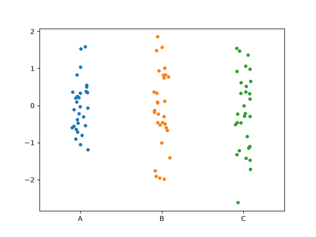 ドットプロット (1)
>>> sns.stripplot(data=df, jitter=False)
<Axes: >
>>> plt.show()
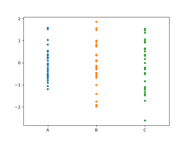 ドットプロット (2)
>>> sns.boxplot(data=df, color='white')
<Axes: >
>>> sns.stripplot(data=df)
<Axes: >
>>> plt.show()
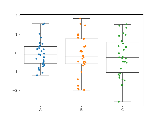 ドットプロット (3)
リスト : ドットプロット (4)

import matplotlib.pyplot as plt
import pandas as pd
import seaborn as sns
import numpy as np

np.random.seed(49)

# 身長
df = pd.DataFrame({
    'Height': [
        148.7, 149.5, 133.7, 157.9, 154.2, 147.8, 154.6, 159.1, 148.2, 153.1,
        138.2, 138.7, 143.5, 153.2, 150.2, 157.3, 145.1, 157.2, 152.3, 148.3,
        152.0, 146.0, 151.5, 139.4, 158.8, 147.6, 144.0, 145.8, 155.4, 155.5,
        153.6, 138.5, 147.1, 149.6, 160.9, 148.9, 157.5, 155.1, 138.9, 153.0,
        153.9, 150.9, 144.4, 160.3, 153.4, 163.0, 150.9, 153.3, 146.6, 153.3,
        152.3, 153.3, 142.8, 149.0, 149.4, 156.5, 141.7, 146.2, 151.0, 156.5,
        150.8, 141.0, 149.0, 163.2, 144.1, 147.1, 167.9, 155.3, 142.9, 148.7,
        164.8, 154.1, 150.4, 154.2, 161.4, 155.0, 146.8, 154.2, 152.7, 149.7,
        151.5, 154.5, 156.8, 150.3, 143.2, 149.5, 145.6, 140.4, 136.5, 146.9,
        158.9, 144.4, 148.1, 155.5, 152.4, 153.3, 142.3, 155.3, 153.1, 152.3
    ],
    'Class': ['A', 'B'] * 50,
    'Gender': np.random.choice(['Male', 'Female'], 100)
})

sns.boxplot(data=df, x = 'Class', y = 'Height', hue = 'Gender', palette='pastel')
sns.stripplot(data=df, x = 'Class', y = 'Height', hue = 'Gender', dodge=True)

plt.show()
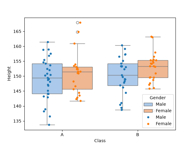 ドットプロット (4)
箱ひげ図の箱ををドットプロットよりも淡い色で塗ると、ドットが見やすくなります。palette のデフォルトは 'deep' で、'pastel' はそれよりも淡い色になります。
●バイオリン図
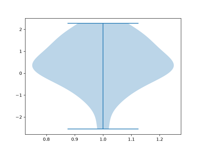
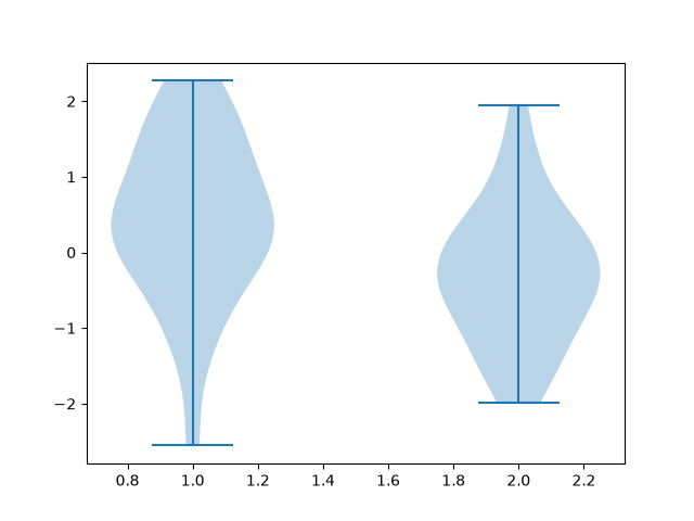
バイオリン図 (violin plot) は、データの分布とその統計的な要約を同時に表現できるグラフです。一般的には、箱ひげ図にカーネル密度プロット (ヒストグラムを滑らかにしたもの) を融合させた構造をしており、データの「偏り」や「山 (モード) の数」を直感的に把握できます。左右対称の形状が弦楽器のバイオリンに似ていることからこの名が付けられました。
バイオリン図はデータの分布密度を外側の膨らみ (バイオリン部分) で表します。横幅が広い部分はデータが集中している (頻度が高い) ことを表し、狭い部分はデータが少ないことを表します。
Python の場合、Matplotlib の関数 plt.violinplot() を使うとバイオリン図を描画することができます。
plt.violinplot(data, ...)
引数 data には配列、配列を格納したリスト、Pandas の DataFrame などを渡します。
主なオプションを以下に示します。
- positions: バイオリンを配置する X 軸 (または Y 軸) の座標を指定 (デフォルト: [1, 2, 3, ...])
positions=[1, 5, 10] のように指定すると、間隔を自由に空けることができる - vert: グラフの向きを決める, True: 縦向き (垂直), False: 横向き (水平), デフォルトは True
- widths: バイオリンの最大幅(太さ)を数値またはリストで指定。隣と重なる場合は小さくする (デフォルト: 0.5)
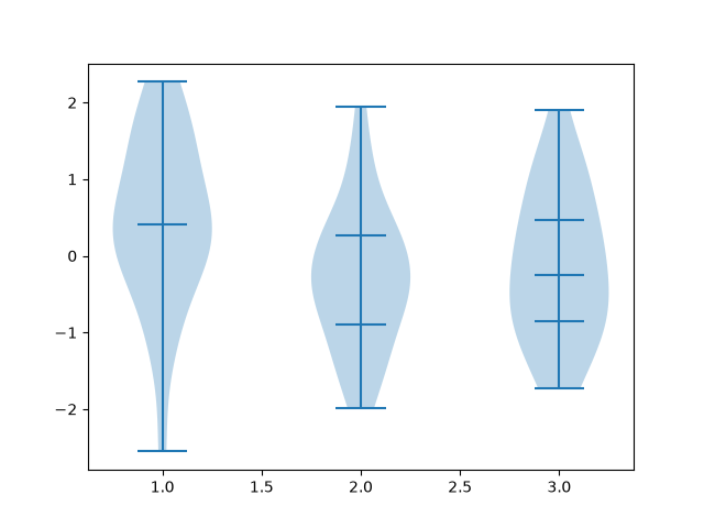
- showmeans=False: 平均値の位置に横線を表示する
- showmedians=False: 中央値の位置に横線を表示する
- showextrema=True: データの最大値から最小値までを繋ぐ中心の縦線を表示する
- quantiles=None: 指定したパーセンタイル(四分位数など)に横線を描く (例: quantiles=[[0.25, 0.75], ...])
簡単な実行例を示しましょう。
>>> import matplotlib.pyplot as plt
>>> import numpy as np
>>> np.random.seed(0)
>>> data1 = np.random.randn(30)
>>> data2 = np.random.randn(30)
>>> data3 = np.random.randn(30)

>>> plt.violinplot(data1)
... 略 ...

>>> plt.show()
 バイオリン図 (1)
>>> plt.violinplot([data1, data2])
... 略 ...

>>> plt.show()
 バイオリン図 (2)
>>> import pandas as pd
>>> df = pd.DataFrame({'data1': data1, 'data2': data2, 'data3': data3})

>>> plt.violinplot(df, quantiles = [[0.5], [0.25, 0.75], [0.25, 0.5, 0.75]])
... 略 ...

>>> plt.show()
 バイオリン図 (3)
色や見た目を変更したい場合は、Seaborn のメソッド sns.violinplot() を使ったほうが簡単です。
sns.violinplot(data=df, x='列名1', y='列名', ...)
引数 data, x, y は boxplot() と同じです。主なオプションを以下に示します。
- hue: データをさらに別のカテゴリで色分けする
- split: hue で指定した 2 つのデータを左右半分ずつに結合する
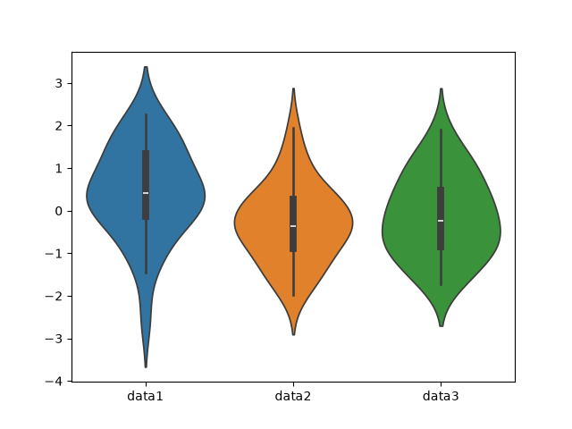
split=True で左右非対称の 1 つのバイオリンになる - inner: バイオリン内部の表示形式を変える
'box' (デフォルトの箱ひげ図), 'quart' (四分位数線), 'point' (点描), None - palette: カラーパレットを変更する (palette="pastel", "Set2", "coolwarm" など)
- bw_adjust: 密度の滑らかさを調整する (bw_adjust=0.5 細かく捉える, bw_adjust=2 滑らかにする)
- orient: グラフの向きを縦・横で指定する ('v': 縦向き, 'h': 横向き)
簡単な実行例を示しましょう。
>>> import seaborn as sns
>>> sns.violinplot(data=df)
<Axes: >
>>> plt.show()
 バイオリン図 (4)
inner='box' の場合、中央の白点は中央値を表します。中央の太い黒線は四分位範囲を表します。中央の細い黒線は「ひげ」を表します。
>>> sns.violinplot(data=df, inner=None)
<Axes: >
>>> plt.show()
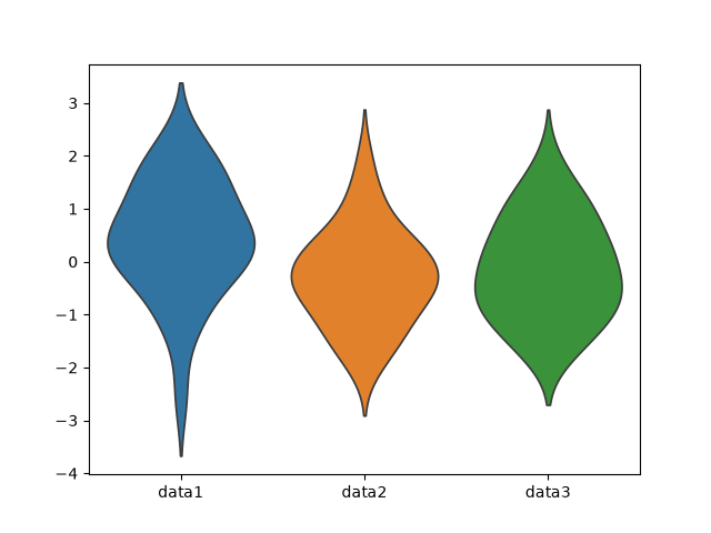 バイオリン図 (5)
リスト : バイオリン図 (6)

import matplotlib.pyplot as plt
import pandas as pd
import seaborn as sns
import numpy as np

np.random.seed(49)

# 身長
df = pd.DataFrame({
    'Height': [
        148.7, 149.5, 133.7, 157.9, 154.2, 147.8, 154.6, 159.1, 148.2, 153.1,
        138.2, 138.7, 143.5, 153.2, 150.2, 157.3, 145.1, 157.2, 152.3, 148.3,
        152.0, 146.0, 151.5, 139.4, 158.8, 147.6, 144.0, 145.8, 155.4, 155.5,
        153.6, 138.5, 147.1, 149.6, 160.9, 148.9, 157.5, 155.1, 138.9, 153.0,
        153.9, 150.9, 144.4, 160.3, 153.4, 163.0, 150.9, 153.3, 146.6, 153.3,
        152.3, 153.3, 142.8, 149.0, 149.4, 156.5, 141.7, 146.2, 151.0, 156.5,
        150.8, 141.0, 149.0, 163.2, 144.1, 147.1, 167.9, 155.3, 142.9, 148.7,
        164.8, 154.1, 150.4, 154.2, 161.4, 155.0, 146.8, 154.2, 152.7, 149.7,
        151.5, 154.5, 156.8, 150.3, 143.2, 149.5, 145.6, 140.4, 136.5, 146.9,
        158.9, 144.4, 148.1, 155.5, 152.4, 153.3, 142.3, 155.3, 153.1, 152.3
    ],
    'Class': ['A', 'B'] * 50,
    'Gender': np.random.choice(['Male', 'Female'], 100)
})

sns.violinplot(data=df, x='Class', y='Height', hue='Gender', palette='pastel', inner=None)
sns.stripplot(data=df, x='Class', y='Height', hue='Gender', dodge=True)

plt.show()
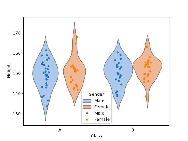 バイオリン図 (6)
●確率密度関数
Seaborn のメソッド sns.kdeplot() は、データの確率密度関数を推定 (カーネル密度推定) し、滑らかな曲線で描画します。簡単に言うと、ヒストグラムを滑らかにした曲線になります。
sns.kdeplot(data, ...)
確率密度関数なので、曲線と x 軸の間の面積が確率を表します (合計 1.0)。確率密度については拙作のページ Algorithms with Python: 統計学の基礎知識 [1] 「連続型の確率分布」をお読みください。
簡単な例を示しましょう。
>>> import matplotlib.pyplot as plt
>>> import numpy as np
>>> import seaborn as sns

>>> np.random.seed(0)
>>> a = np.random.randn(100)

>>> sns.kdeplot(a)
<Axes: ylabel='Density'>
>>> plt.show()
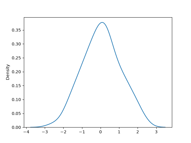 確率密度関数 (1)
ヒストグラムと確率密度関数を重ねる場合、sns.histplot() の引数に kde=True を渡すだけで描画することができます。
>>> sns.histplot(a, kde=True)
<Axes: ylabel='Count'>
>>> plt.show()
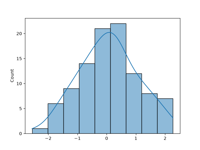 確率密度関数 (2)
>>> b = np.random.randn(100) + 2
>>> c = np.random.randn(100) + 4
>>> sns.kdeplot(a)
<Axes: ylabel='Density'>
>>> sns.kdeplot(b)
<Axes: ylabel='Density'>
>>> sns.kdeplot(c)
<Axes: ylabel='Density'>
>>> plt.show()
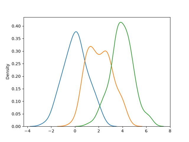 確率密度関数 (3)
kdeplot() の引数 x と y にデータを渡すと、2 次元の確率密度関数を描画することができます。
>>> sns.kdeplot(x=a, y=c, fill=True, cmap='viridis')
<Axes: >
>>> plt.show()
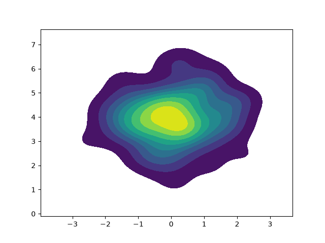 確率密度関数 (4)
●正規分布
次の式で表される確率分布を「正規分布」といいます。
これを平均 \(\mu\)、分散 \(\sigma^2\) の正規分布といい、\(N(\mu, \sigma^2)\) と略記します。特に、\(N(0, 1)\) を「標準正規分布」といいます。この式を Python でプログラムすると、次のようになります。
リスト : 正規分布 (norm01.py)

import matplotlib.pyplot as plt
import numpy as np
import math

# 正規分布
def make_norm(m, s2):
    return lambda x: 1 / math.sqrt(2 * np.pi * s2) * math.exp(- ((x - m) ** 2) / (2 * s2))

n1 = make_norm(0, 1)
x1 = np.linspace(-4, 4, 1000)
y1 = [n1(x) for x in x1]

plt.plot(x1, y1)

n2 = make_norm(1, 2)
x2 = np.linspace(-3, 5, 1000)
y2 = [n2(x) for x in x2]

plt.plot(x2, y2)

n3 = make_norm(-2, 0.5)
x3 = np.linspace(-5, 3, 1000)
y3 = [n3(x) for x in x3]

plt.plot(x3, y3)

plt.show()
関数 make_norm() の引数 m が平均 \(\mu\)、s2 が分散 \(\sigma^2\) を表します。分散のかわりに \(\sigma\) を渡す場合もあります。返り値が \(N(\mu, \sigma^2)\) を表す関数になります。正規分布は次の図に示すような釣鐘状の曲線 (ベル・カープ) になります。
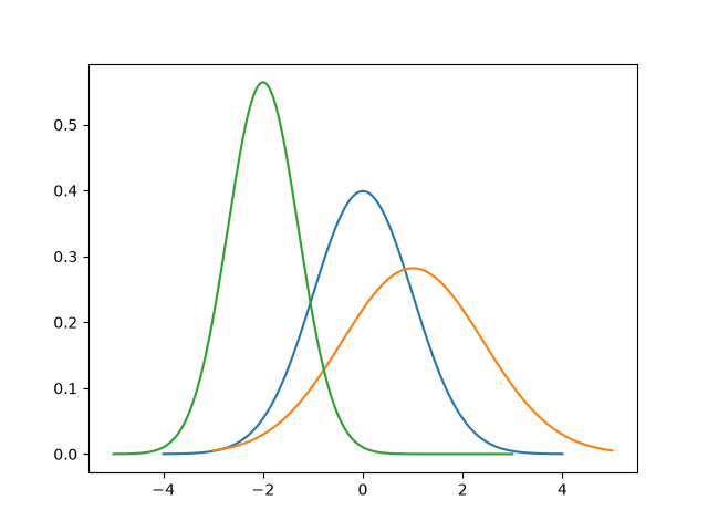 正規分布 (1)
青線が N(0, 1)、赤線が N(1, 2)、緑線が N(-2. 0.5) です。正規分布は、平均値のデータが一番多く、分散の値が小さいほど平均値にデータが集まるので、ベル・カーブの頂点が高くなります。分散の値が大きくなると、ベル・カーブの頂点は低くなり裾野が広がります。ようするに、分散の値だけで正規分布の形が決まるわけです。
正規分布の場合、\(-\sigma \lt x \lt \sigma\) の確率が 68.26 % で、\(-2\sigma \lt x \lt 2\sigma\) の確率が 95.44 % になります。したがって、下図のように標準正規分布では \(-1 \lt x \lt 1\) の確率が 68.26 % で、\(-2 \lt x \lt 2\) の確率が 95.44 % になります。
リスト : 正規表現 (2)

import matplotlib.pyplot as plt
import numpy as np
import math

# 正規分布
def make_norm(m, s2):
    return lambda x: 1 / math.sqrt(2 * np.pi * s2) * math.exp(- ((x - m) ** 2) / (2 * s2))

n1 = make_norm(0, 1)
x1 = np.linspace(-4, 4, 1000)
y1 = [n1(x) for x in x1]

x2 = np.linspace(-1, 1, 400)
y2 = [n1(x) for x in x2]

plt.plot(x1, y1)
plt.fill_between(x2, y2, color='pink', alpha=0.7)

plt.show()
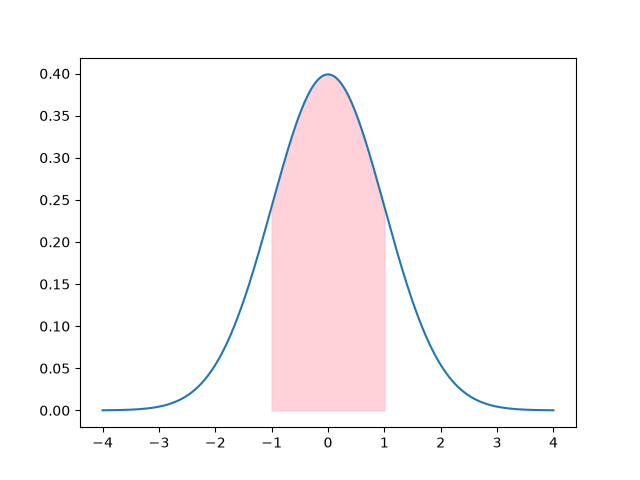 正規分布 (2)
リスト : 正規分布 (3)

import matplotlib.pyplot as plt
import numpy as np
import math

# 正規分布
def make_norm(m, s2):
    return lambda x: 1 / math.sqrt(2 * np.pi * s2) * math.exp(- ((x - m) ** 2) / (2 * s2))

n1 = make_norm(0, 1)
x1 = np.linspace(-4, 4, 1000)
y1 = [n1(x) for x in x1]

x2 = np.linspace(-2, 2, 400)
y2 = [n1(x) for x in x2]

plt.plot(x1, y1)
plt.fill_between(x2, y2, color='pink', alpha=0.7)

plt.show()
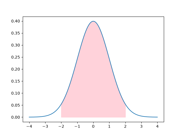 正規分布 (3)
●図形の描画
多角形の描画 では、関数 plt.fill() を使って任意の多角形や領域を描画しました。このほかに、モジュール matplotlib.patches を使う方法があり、いろいろな図形を簡単に描画することができます。基本的には、円、長方形、多角形などのオブジェクトを作成し、それをメソッド ax.add_patch() でグラフに追加します。
matplotlib.patches でよく使われる図形クラスを以下に示します。
- 円: patches.Circle(xy=(x, y), radius=r)
xy は中心の座標, radius は半径を指定する - 楕円: patches.Ellipse(xy=(x, y), width=w, height=h, angle=deg)
width は幅、height は高さ、angle は回転角を指定する - 長方形: patches.Rectangle(xy=(x, y), width=w, height=h)
xy は左下の角の座標を指定する - 多角形: patches.Polygon(xy=[[x1, y1], [x2, y2], ...])
xy には各頂点の座標を配列で渡す - 扇形: patches.Wedge(center=(x, y), r=radius, theta1=deg, theta2=deg)
中心、半径、開始・終了角度を指定する - 円弧: patches.Arc(xy=(x, y), width=w, height=h, theta1=deg, theta2=deg)
中心、幅、高さ、開始・終了角度を指定する
よく使われるオプションを以下に示します。
- facecolor (fc): 図形の内側の塗りつぶし色 (None にすると枠線だけになる)
- fill= True / False: 図形の内側を塗りつぶすか (デフォルトは True)
- edgecolor (ec): 枠線の色
- linewidth (lw): 枠線の太さ
- linestyle (ls): 線の種類 ('-', '--', ':' など)
- alpha: 透明度 (0.0 〜 1.0)
簡単な使用例を示します。
リスト : 五角形の表示

import matplotlib.pyplot as plt
import matplotlib.patches as patches

fig, ax = plt.subplots()

poly = patches.Polygon(
    xy=[[1,10], [6,15], [11,10], [8.5,2], [3.5,2]],
    lw=2
)
ax.add_patch(poly)
ax.set_xlim(0, 12)
ax.set_ylim(0, 16)
ax.set_title('Polygon')

plt.show()
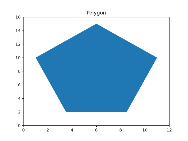 五角形
五角形
リスト : 長方形

import matplotlib.pyplot as plt
import matplotlib.patches as patches

fig, ax = plt.subplots()

ps = [[2,1],[4,1],[6,1],[8,1]]
cs = ['blue', 'orange', 'green', 'red']

for (x,y), c in zip(ps, cs):
    rect = patches.Rectangle(xy=(x, y), width=2, height=14, color=c)
    ax.add_patch(rect)

ax.set_xlim(0, 12)
ax.set_ylim(0, 16)
ax.set_title('Rectangle')

plt.show()
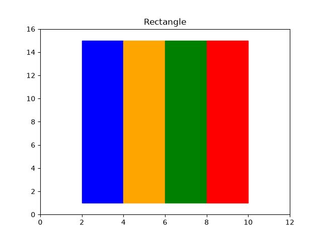 長方形
長方形
リスト : 図形の重ね合わせ

import matplotlib.pyplot as plt
import matplotlib.patches as patches

fig, ax = plt.subplots()

poly = patches.Polygon(
    xy=[[1,10], [6,15], [11,10], [8.5,2], [3.5,2]],
    lw=2, alpha=0.5
)
ax.add_patch(poly)

ps = [[2,1],[4,1],[6,1],[8,1]]
cs = ['blue', 'orange', 'green', 'red']

for (x,y), c in zip(ps, cs):
    rect = patches.Rectangle(xy=(x, y), width=2, height=14, color=c, alpha=0.5)
    ax.add_patch(rect)

ax.set_xlim(0, 12)
ax.set_ylim(0, 16)
ax.set_title('Polygon + Rectangle')

plt.show()
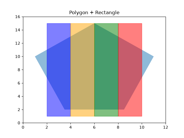 重ね合わせ
重ね合わせ
リスト : 円、楕円、円弧など

import matplotlib.pyplot as plt
import matplotlib.patches as patches

layout = [
    ['A', 'B'],
    ['C', 'D']
]

fig, axd = plt.subplot_mosaic(layout, figsize=(8, 5), layout='tight')

c1 = patches.Circle(xy=(0, 0), radius=1, lw=2)
axd['A'].add_patch(c1)

axd['A'].set_aspect('equal')
axd['A'].grid(True)
axd['A'].set_xlim(-2, 2)
axd['A'].set_ylim(-1.5, 1.5)
axd['A'].set_title('Circle')

c2 = patches.Arc(xy=(0, 0), width=2, height=2, lw=2,
                 theta1=0, theta2=270, color='orange')
axd['B'].add_patch(c2)
axd['B'].set_aspect('equal')
axd['B'].grid(True)
axd['B'].set_xlim(-2, 2)
axd['B'].set_ylim(-1.5, 1.5)
axd['B'].set_title('Arc')

e1 = patches.Ellipse(xy=(0, 0), width=3, height=1.5,
                     angle=30, color='green')
axd['C'].add_patch(e1)
axd['C'].set_aspect('equal')
axd['C'].grid(True)
axd['C'].set_xlim(-2, 2)
axd['C'].set_ylim(-1.5, 1.5)
axd['C'].set_title('Ellipse')

w1 = patches.Wedge(center=(0, 0), r=1, theta1=90, theta2=360, color='red')
axd['D'].add_patch(w1)

axd['D'].set_aspect('equal')
axd['D'].grid(True)
axd['D'].set_xlim(-2, 2)
axd['D'].set_ylim(-1.5, 1.5)
axd['D'].set_title('Wedge')

plt.show()
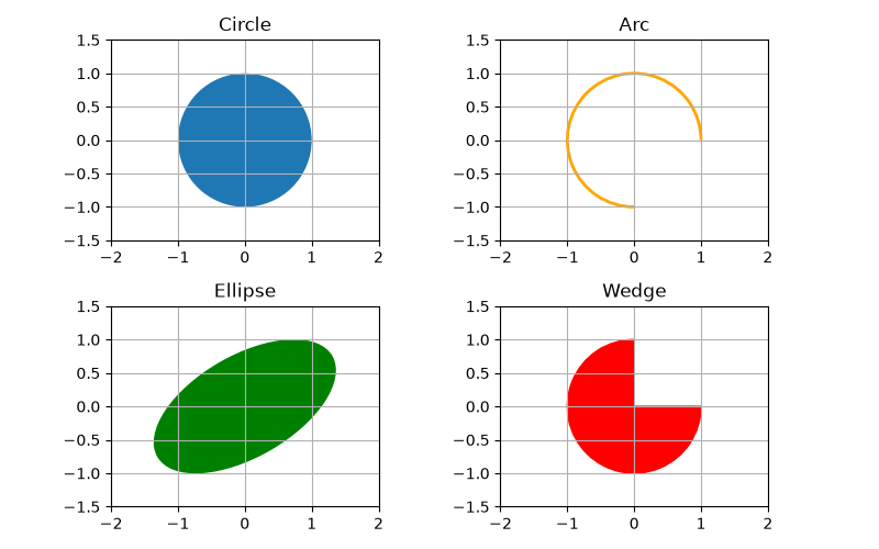 円、楕円、円弧など
●複数軸と複合グラフ
2 つのグラフを描画するとき、それらの値が大きく異なると、同一スケールではわかりにくくなります。この場合、左側の Y 軸だけではなく、右側の Y 軸にもスケールを設定すると便利です。たとえば、2024 年度東京都月別平均気温と降水量 を折れ線グラフで表してみましょう。左 の Y 軸を降水量、右の Y 軸を平均気温とすると、プログラムは次のようになります。
リスト : 二軸グラフ

import matplotlib.pyplot as plt
import numpy as np

plt.rcParams['font.family'] = 'Noto Sans CJK JP'

month = range(1, 13)
data1 = [36, 78.5, 188.5, 115.5, 201.5, 350.0, 206.5, 381.0, 111.5, 174.5, 82.0, 0.5]  # 降水量
data2 = [7.1, 8.0, 9.6, 17.1, 20.0, 23.1, 28.7, 29.0, 26.6, 20.6, 13.7, 8.1]           # 平均気温

fig, ax1 = plt.subplots()

ax1.plot(month, data1, marker='o', label='降水量')
ax1.set_xlabel('月')
ax1.set_ylabel('降水量 (mm)')
ax1.set_ylim(0, 400)
ax1.grid(True)
ax1.set_title('二軸グラフ')

ax2 = ax1.twinx()
ax2.plot(month, data2, marker='o', color='orange', label='平均気温')
ax2.set_ylabel('平均気温 (℃)')
ax2.set_ylim(0, 40)

handler1, label1 = ax1.get_legend_handles_labels()
handler2, label2 = ax2.get_legend_handles_labels()
ax1.legend(handler1 + handler2, label1 + label2, loc='upper left')

plt.show()
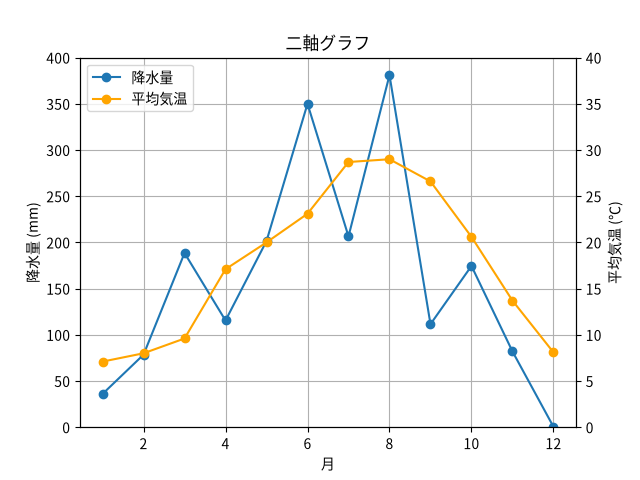 二軸グラフ
二軸グラフ
降水量を表す折れ線グラフは今までと同じ方法で描画します。Matplotlib で「二軸グラフ」を作成するには、ax1.twinx() を使用して X 軸を共有する 2 つ目の Y 軸を作成します。
ax2 = ax1.twinx()
返り値 ax2 が右側の Y 軸を表します。あとは ax2 に対して、平均気温の折れ線グラフを plot() で描画します。この場合、ax1.legend() と ax2.legend() を別々に呼ぶと、凡例が重なってしまいます。上記コードのように、それぞれの軸から get_legend_handles_labels() で「プロット (handler)」と「ラベル名 (label)」のリストを取り出し、それらを足し算して 1 つの legend() に渡します。handler と label は Python のリストなので、演算子 + で連結することができます。
次は降水量を棒グラフに変更してみましょう。2 種類以上の異なるチャートを表示するグラフを「複合チャート」とか「複合グラフ」といいます。次のリストを見てください。
リスト : 複合グラフ

import matplotlib.pyplot as plt
import numpy as np

plt.rcParams['font.family'] = 'Noto Sans CJK JP'

month = range(1, 13)
data1 = [36, 78.5, 188.5, 115.5, 201.5, 350.0, 206.5, 381.0, 111.5, 174.5, 82.0, 0.5]  # 降水量
data2 = [7.1, 8.0, 9.6, 17.1, 20.0, 23.1, 28.7, 29.0, 26.6, 20.6, 13.7, 8.1]           # 平均気温

fig, ax1 = plt.subplots()

ax1.bar(month, data1, alpha=0.6, label='降水量')
ax1.set_xlabel('月')
ax1.set_ylabel('降水量 (mm)')
ax1.set_ylim(0, 400)
ax1.grid(True)
ax1.set_title('複合グラフ')

ax2 = ax1.twinx()
ax2.plot(month, data2, marker='o', color='orange', label='平均気温')
ax2.set_ylabel('平均気温 (℃)')
ax2.set_ylim(0, 40)

handler1, label1 = ax1.get_legend_handles_labels()
handler2, label2 = ax2.get_legend_handles_labels()
ax1.legend(handler1 + handler2, label1 + label2, loc='upper left')

plt.show()
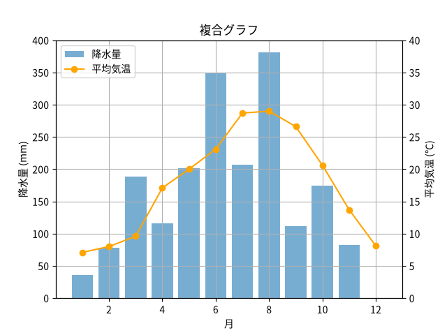 複合グラフ
複合グラフ
このように、ax1.plot() を ax1.bar() に変更するだけで、棒グラフを描画することができます。
●おわりに
Matplotlib と Seaborn の基本的な使い方を簡単に説明しました。Matplotlib と Seaborn は高性能かつ多機能なライブラリなので、初心者 (M.Hiroi も含む) が使いこなすのはちょっと大変だと思いますが、基本的な操作はそれほど難しくはありません。興味のある方はいろいろ試してみてください。